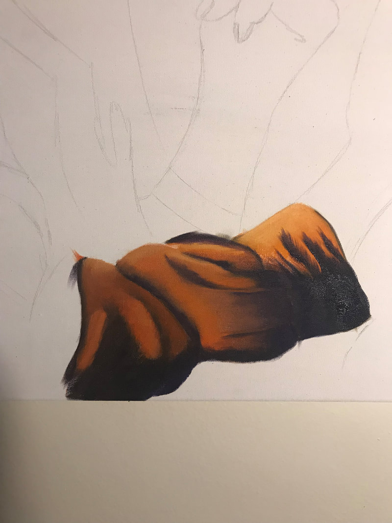
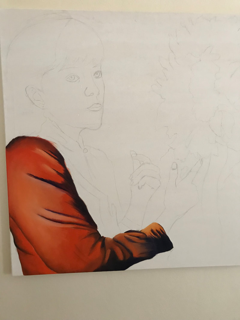
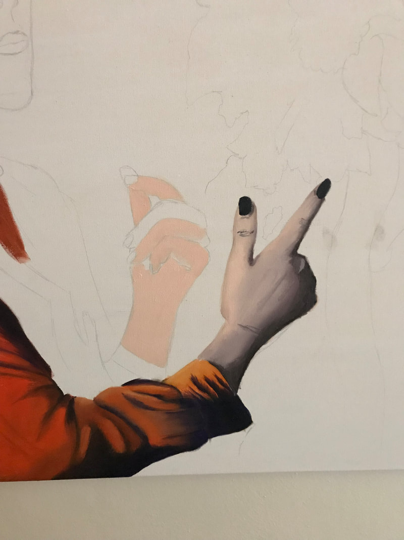
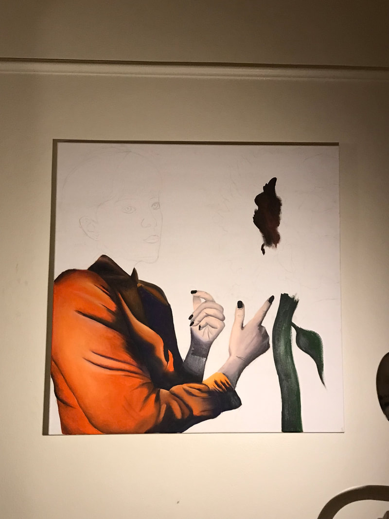
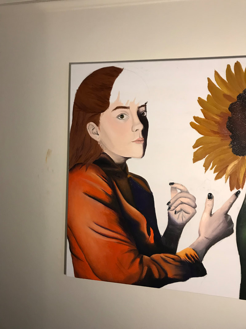
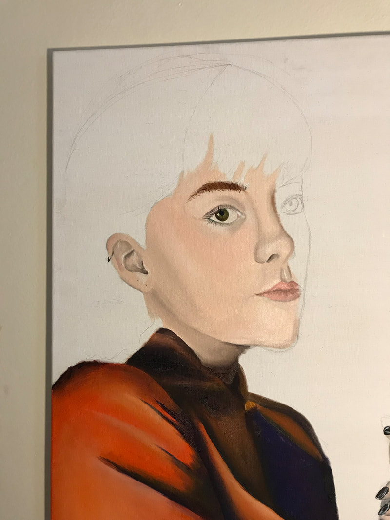
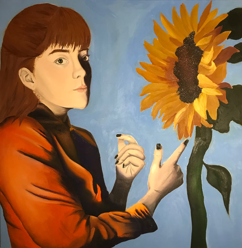
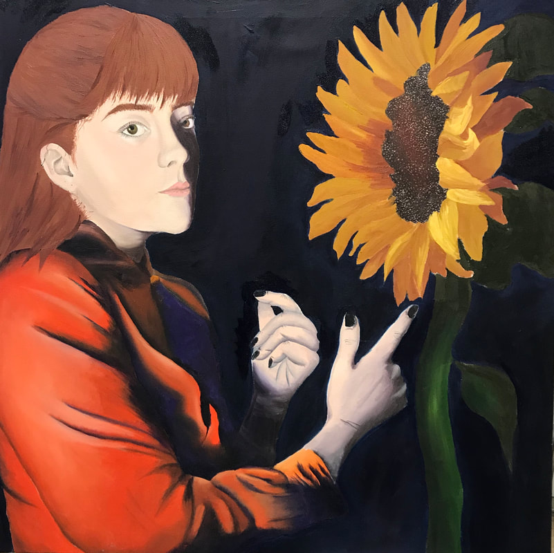
Self Portrait
|
Self PortraitOil on canvas
91.44cm X 91.44cm February 22nd, 2019 |
Exhibition Text
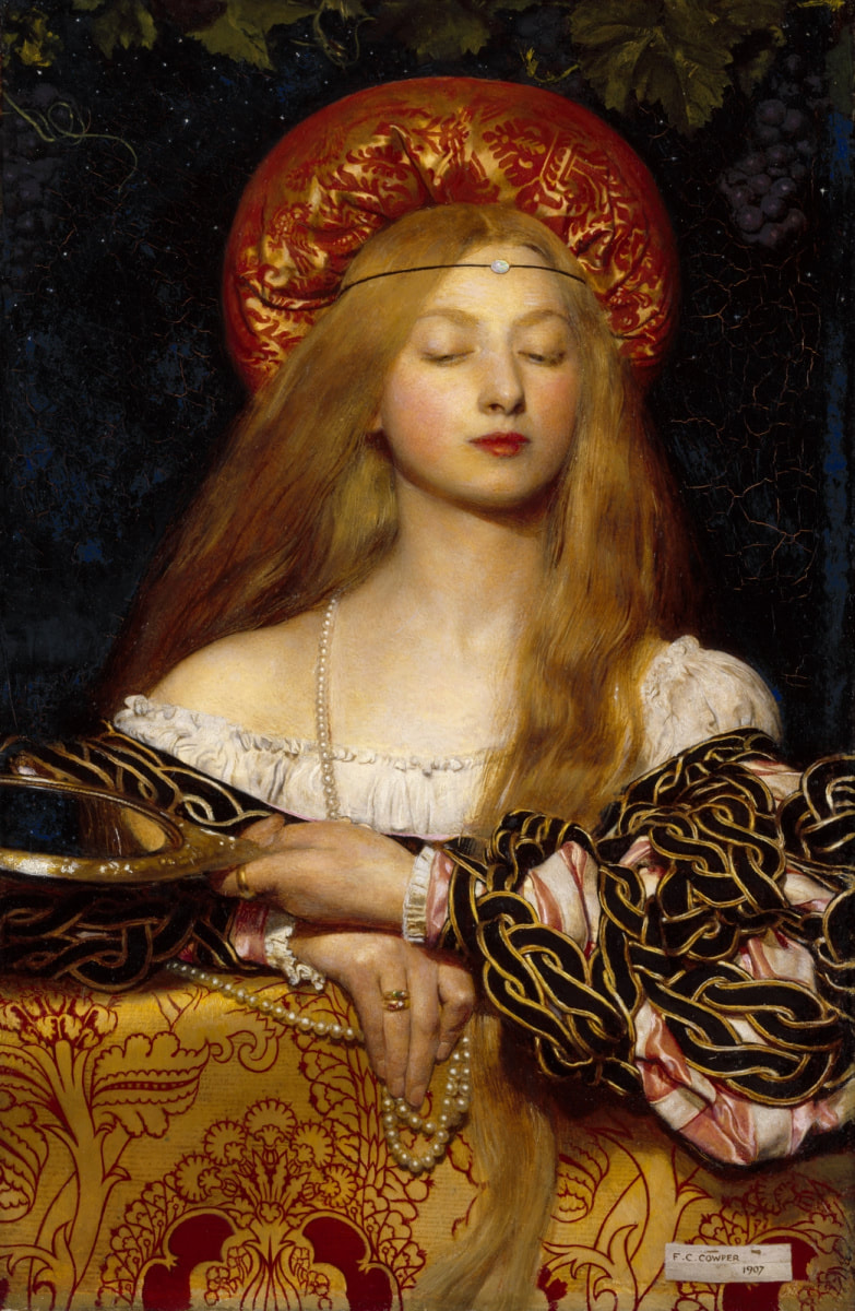
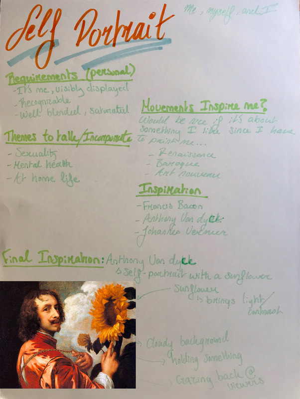
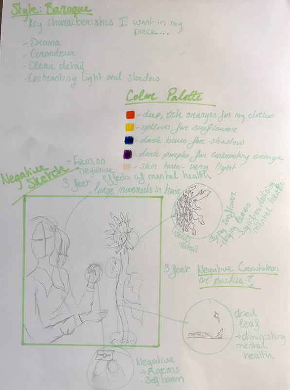
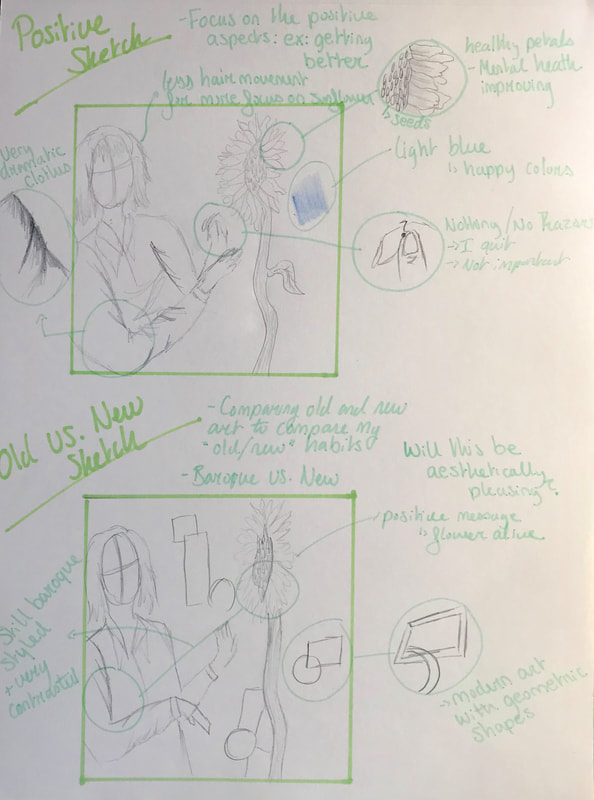
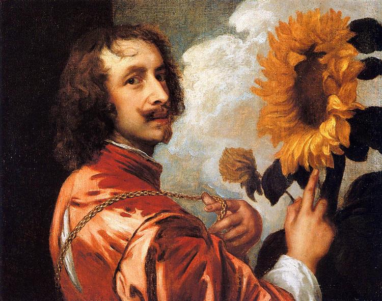
Through the recreation of Anthony Van Dyck and Frank Cowper's work, Self Portrait depicts my journey improving my mental health through negative and positive connotations.