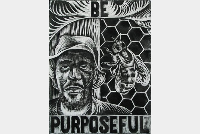
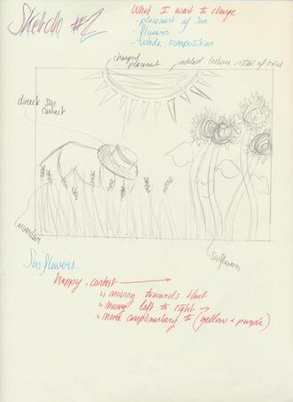
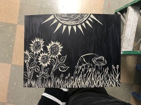
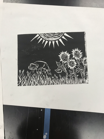
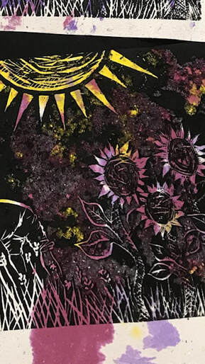
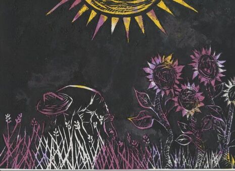
Sous le Soleil
|
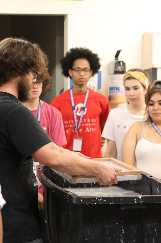
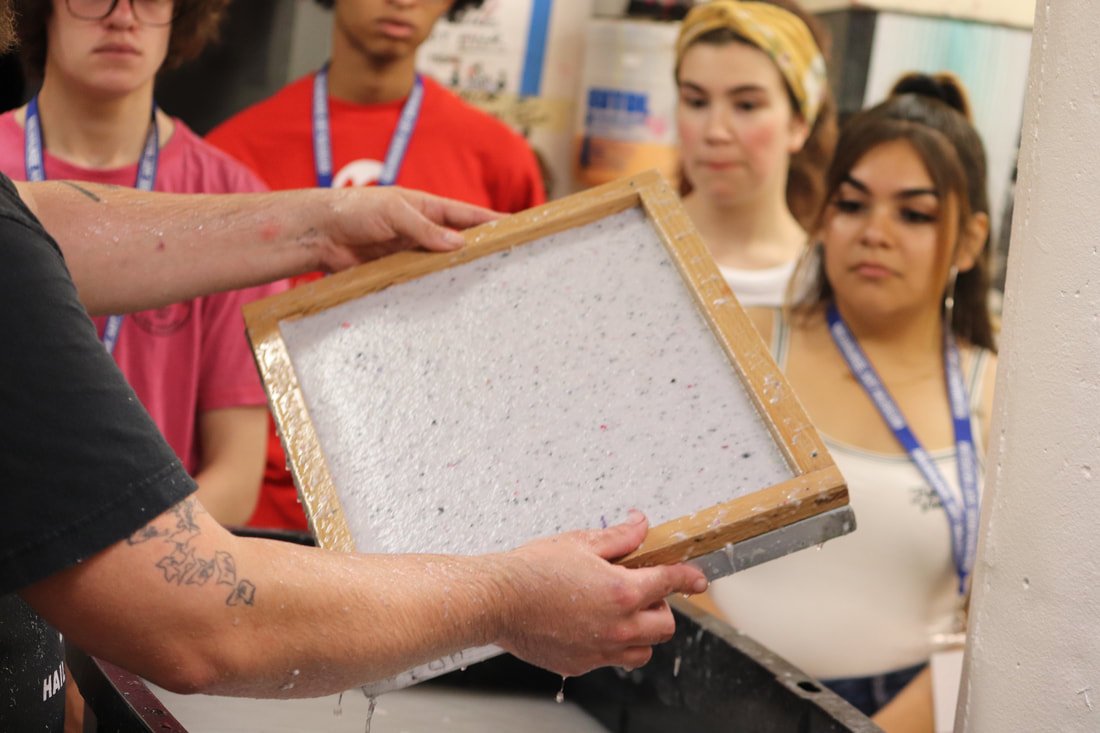
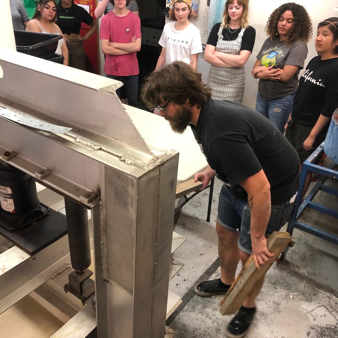
Water based ink on handmade paper
cm x cm September 8th, 2019 |
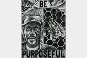
Exhibition Text
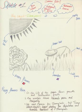
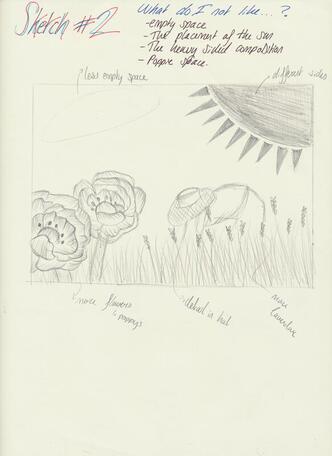
This piece reflects the hard work of often mistreated immigrants. Inspired by Raoul Deal and John Fleissner, the block print reflects old political prints.