
|
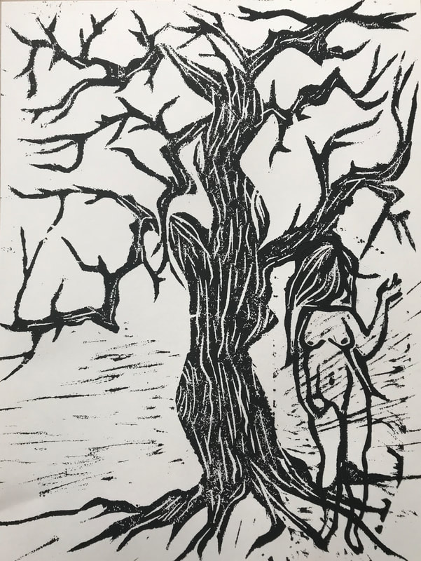
EveWater based ink on paper- Print
Medium: Block Print 216cm x 279 January 25th, 2019 |
Exhibition Text
Eve is a reflection of feminism in society present day while modernizing the classic biblical story Adam and Eve. This makes the viewers reflect upon how much progress has been made towards the rights for women. The concept was inspired by a local artist, Jim Spitzer. In addition, it was inspired by Jost Amman and Linnane Armstrong for the elemental aspects of the piece.
Planning
Inspiration

https://www.annexgalleries.com/artists/biography/2237/Spitzer/James
http://www.getty.edu/art/collection/artists/968/jost-amman-swiss-1539-1591/

http://www.robschoutengallery.com/linnane-armstrong/
|
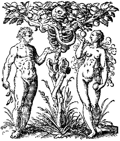
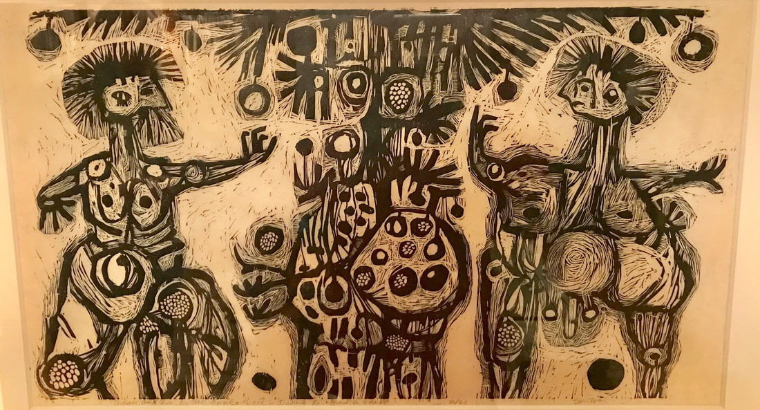
The concept of my block print was based off of a small local artist. Jim Spitzer was born in Milwaukee, Wisconsin in 1936 and later on continued his education at Madison University. This painting called "Adam and Eve by the Apple Tree Trying to Find a Snake" always caught my attention. A close friend of ours bought it in a gallery for 25$. This print dates back to the 1960's. I loved the geometric shapes in the print, making it seem more abstract. I wanted to do something in the same sort, a lot of geometric shapes. I also wanted the softness of the shapes in my work, unlike most block prints that are very angular. Therefore, the concept inspired me and so did the shapes and lines did.
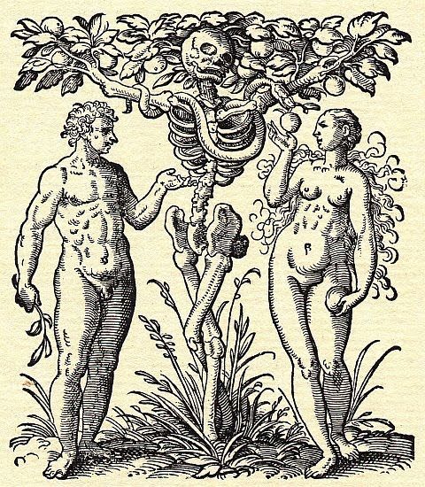
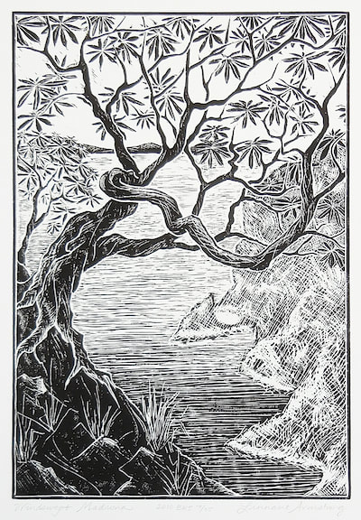
The second print is based off of Jost Amman, a Swiss-German artist well known for his illustrations in the 16th century. Personally, I find the illustration very interesting. The line work is the best part about it. What I used from this piece to inspire my work was Eve. I wanted her to resemble old illustrations, especially the characteristics like the woman being chubbier. Even though the proportions are off, I find the way they depicted women is elegant and realistic. I wanted that aspect to be in my art along with the lines and detail. Lastly, for the tree in my block print, I wanted a tree that was very angular to contrast the softness of Eve. I chose the work of Linnane Armstrong for inspiration. She makes prints of nature using great use of harsh and soft lines. I also love the contrast of the darkness of the tree against the background. That is another element I wanted in my art. Therefore I used this contrast of line in my work. |
Planning Sketches
|
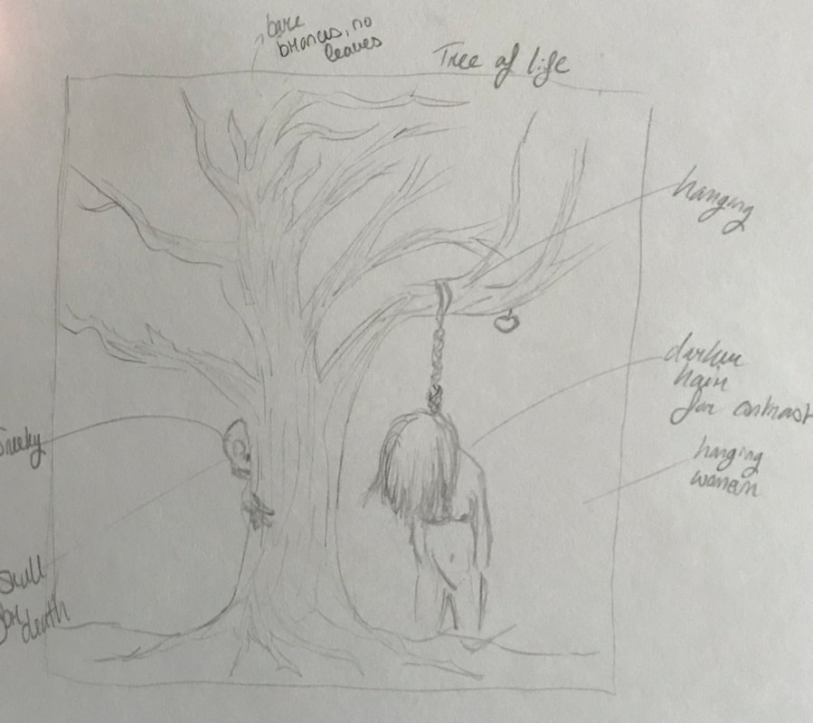
This was my first preliminary sketch. I used the tree of life, with eve hanging from the tree. I used this gruesome display because back in the 16th century and earlier, women were hung for being "out of hand". Behind the tree there is a skull to show the death lurking. I wanted it to be an eerie piece, however I wasn't really fond of the negative message it had to portray.
|
|
In this sketch I tried using new and old concepts. Therefore there would be the woman hanging to demonstrate old, gruesome aspects of feminism. Then the contrast would be the present, where woman in developed countries have rights. Again, I discarded this idea due to the focus of negative aspects in my work. I wanted something positive.
|

|
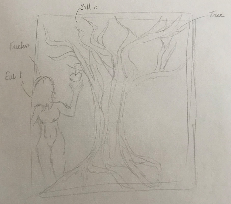
This is my third and final sketch. I removed any negative aspects of the drawing and decided to go with something much more positive. The tree was something that I always wanted incorporated in my work. This was because I wanted to provide the print with variety, such as harsh lines compared to soft. In addition, I never added a face because I didn't want it to be Eve herself, but a generic version of a woman due to feminism and women's rights a team work rather than one person.
|
Creative Process
|
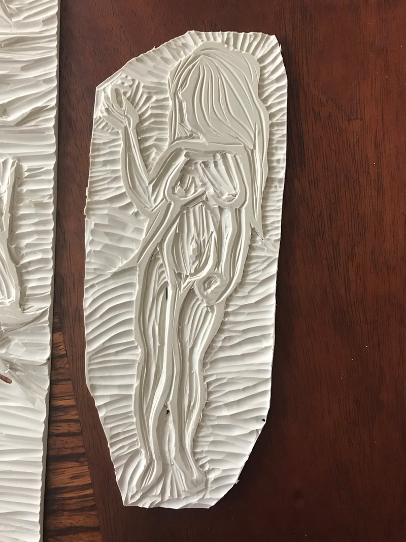
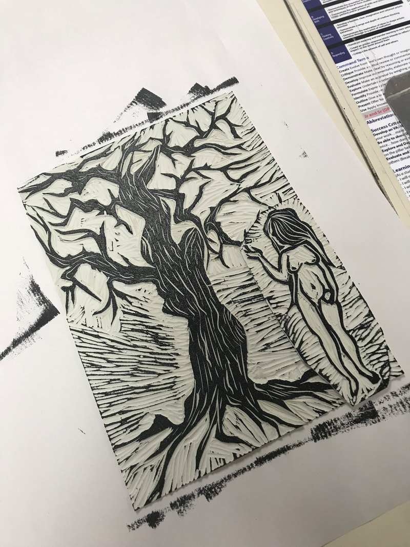
First off, I sketched out the lines I would keep for the form of the body. Then I went around Eve carving out any pieces I could from the outside. I didn't want her to be a solid back silhouette, therefore I had to carve her body out too to reveal all the detail.
|
|
This was my carved out block. I tried to keep as much as I possibly could to still reveal detail. Her hair I left almost entirely solid because I wanted a bit of balancing contrast. For detail I carved out small pieces.
|
|
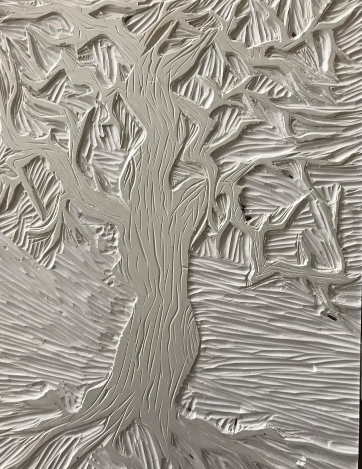
Here is the tree I made for Eve to go under. I carved harsh geometric shapes into a big piece so I could have a decent sized print. After I carved out the shape of the tree, I went back in to add lines for detail and extra texture.
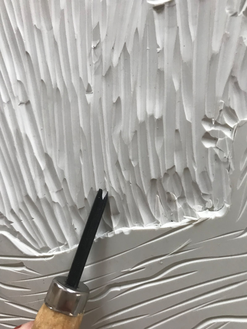
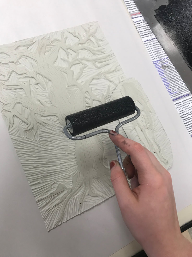
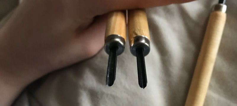
This is one of the carving tools I used to carve out the plastic. It was a very tedious job, but overall I'm content with the outcome of the detail, as I tried to incorporate as much as I could. This process was used for both the tree and Eve. Here is the process where I took the ink with a roller and saturated the slab to create the print. I went over it 6 to 7 times just to make extra sure that what I was doing was going to turn out with a solid print. These are my two slabs covered in ink. After this I put a piece of print paper and applied pressure with the barrings to create the print. I tried this multiple times, around 7 to 8 times. I wanted the perfect print. |
Experimentation
|
|
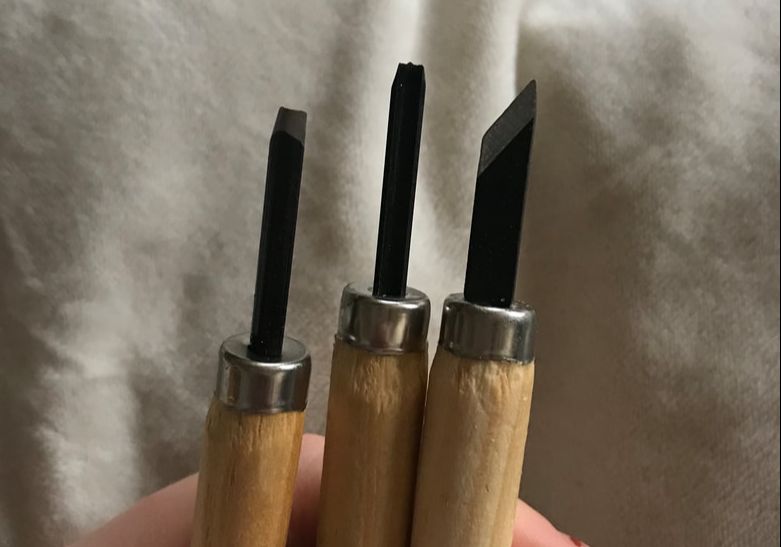
For my experimentation, I tried to add as much detail into my print as possible. It can be hard to do so with a block print, however I was up to the challenge. I used three different carving tools to achieve the most precise print possible. I tried different methods with the tools such as cutting out pieces, carving them with different types of tool heads, and using various amounts of pressure to carve deeper or more shallow. In the picture above, there is a triangular carving tool. I used that tool to make more detailed carvings with sharp edges. Lastly, the round edge tool was used to carve out large, un-detailed chunks of plastic.
Critique
|
My work compared to the work off Jost Ammam is drastically different. The lines in his work are very thin and clearly made from an ink pen, however my piece has thick, present lines. Of course, certain elements aren't in my work such as Adam and the tree of death.
The tree in my piece is much different than the work of Linnane. My tree has a lot more negative space than positive, however in Linnane's is positive. Her lines are more soft in comparison to mine. In addition, she has a lot more little details that got lost in my block print. I believe, in the end my block print and the print of Jim Spitzer is very different. He has more organic shapes and the scratching is very prevalent in this piece, whereas mine is more clear and crisp. It also has a lot of abstract elements and that is not something I incorporated. In the end, the only thing similar is the concept of the piece with Adam and Eve. |
|
Reflection
This project was hard, but not as bad as the dry point. I did hurt myself a lot during this project and in addition, the cutting tools were hard to manipulate. I learned a lot of new concepts however and I learned how to let go of my perfectionist side. This project required me to leave out a lot of detail because the amount of scratching needed to do leaves out options for precision. I think if I could go back and do it again, I would try to add more detail in the carvings with sharper, finer tools.
During the printing process, I noticed the paint was repelling off itself. After asking what's wrong, I learned that the oils on my fingers can cause the water based ink to repel. However, when it did repel, it created a cool texture that I added to my final product. I did around 7 to 8 prints to figure out how much ink on the plates is necessary. After that I went through the final products to see if I like, I decided the one with texture is by far the best. I think it adds character.
During the printing process, I noticed the paint was repelling off itself. After asking what's wrong, I learned that the oils on my fingers can cause the water based ink to repel. However, when it did repel, it created a cool texture that I added to my final product. I did around 7 to 8 prints to figure out how much ink on the plates is necessary. After that I went through the final products to see if I like, I decided the one with texture is by far the best. I think it adds character.
Connecting to the ACT
Clearly explain how you are able to identify the cause effect relationship between your inspiration and its effect on your artwork?
My inspiration effected the line work in my piece, the organic and non organic shapes and the thickness of the lines.
What is the overall approach the author has regarding the topic of your inspiration?
Most of the websites I did my research on are by museums or curators. Therefore there was no bias or personal belief in their writing, just factual information on the artist.
What kind of generalizations and conclusions have you discovered about people, ideas, culture, etc. while you researched your inspiration?
I've learned about biblical passages and the stance of people on Adam and Eve from the 16th century. There is a whole culture of itself when it comes to religion and Christianity, especially when it comes to it's influential impact on society.
What is the central idea or theme around your inspirational research?
Feminism and strong women is the central theme for my piece and the inspirational research was the repression of women back in the 16th century.
What kind of inferences did you make while reading your research?
The inferences I made were that women would be perceived of poorly due to their lack of importance in society back in the 16th century.
