|
FlagInk, Colored pencils and Photoshop
20.32 cm X 27.94 cm March 12th, 2019 |
Inspired by flags around the world, I made a flag that connects my high school's, district's and IB's culture.
|
|
|
|
|
|
FlagInk, Colored pencils and Photoshop
20.32 cm X 27.94 cm March 12th, 2019 |
|
|
|
|
|
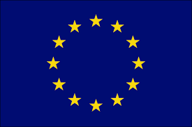
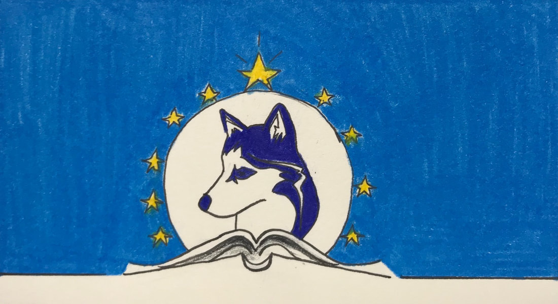
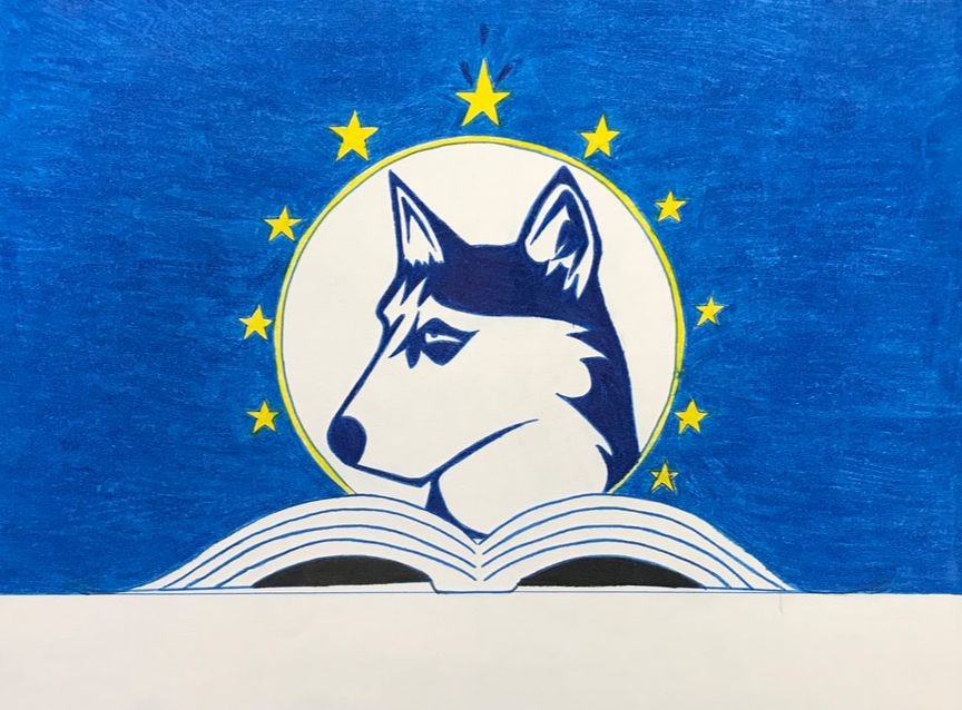
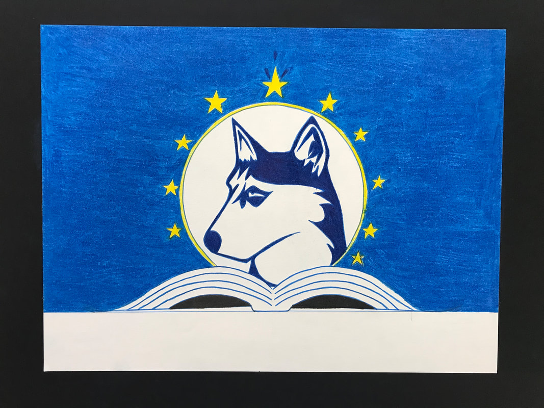
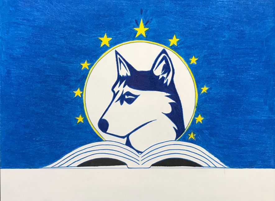
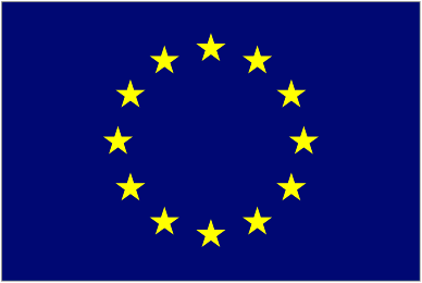
The European Union flag inspired me for the stars. In the IB learner profile traits, there are 10 learner profiles. This means a lot to IB students because we tend to follow those 10 traits and they define us not only as students, but as a community. For most of my sketches I made one star bigger than the others to depict how we excel in academics. The boarder of it all makes it neat and easy to recognize, something I wanted to include in many of my sketches.
|

|
For my color scheme, the Milwaukee flag inspired me. Not only is it local, but it has many important colors to it. The MPS, my school district, colors are yellow and a dark blue. The IB colors are dark blue and white. Lastly, our school colors are the same as IB. I really liked how those three colors complimented each other and fit the three organization's colors. Blue represents wisdom, imagination and expansiveness. Often times dark blues are seen as the "intelligent" color. Yellow stands for positive, optimism, and intellect. It describes our school perfectly.
|
Post Critique |
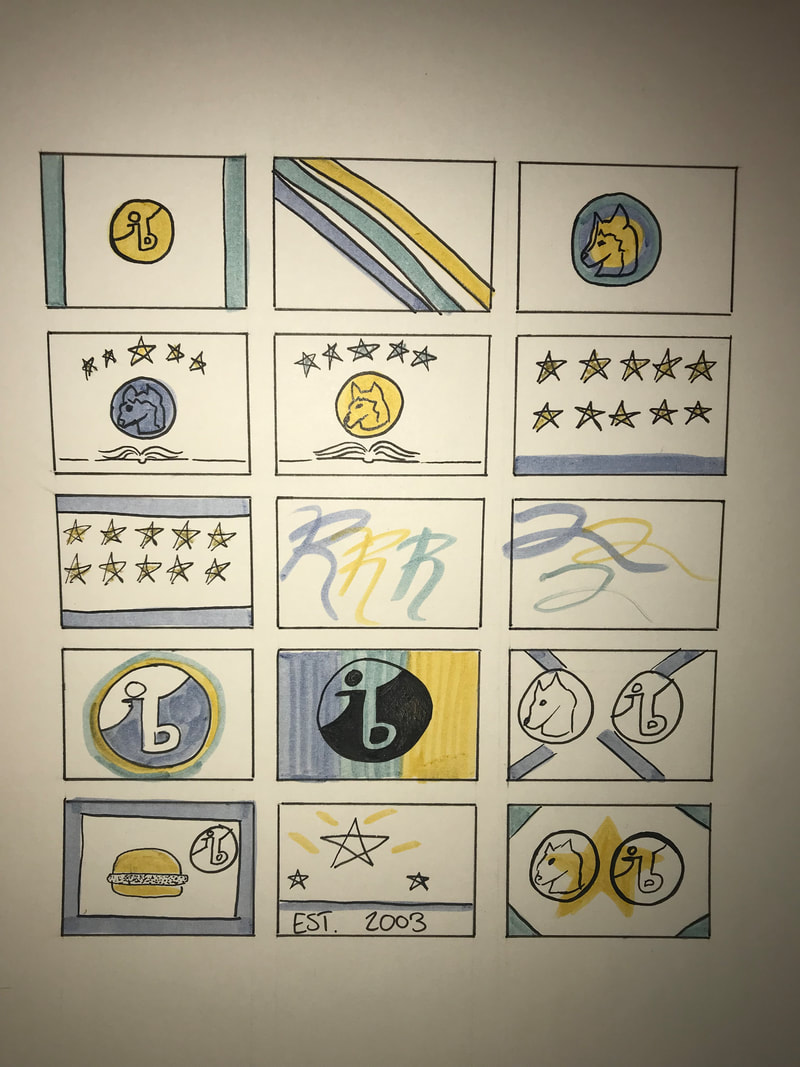
These are my preliminary 15 sketches for MIAD to critique. Most of them where just to play around with colors and to see how I would like to lay out my flag. Some of them weren't as serious as others. These small frames helped me find out simple color scheme and layout. Many of them were loosely inspired off of European flags such as the UK flag. Others were U.S. based such as the Chicago flag.
|
|
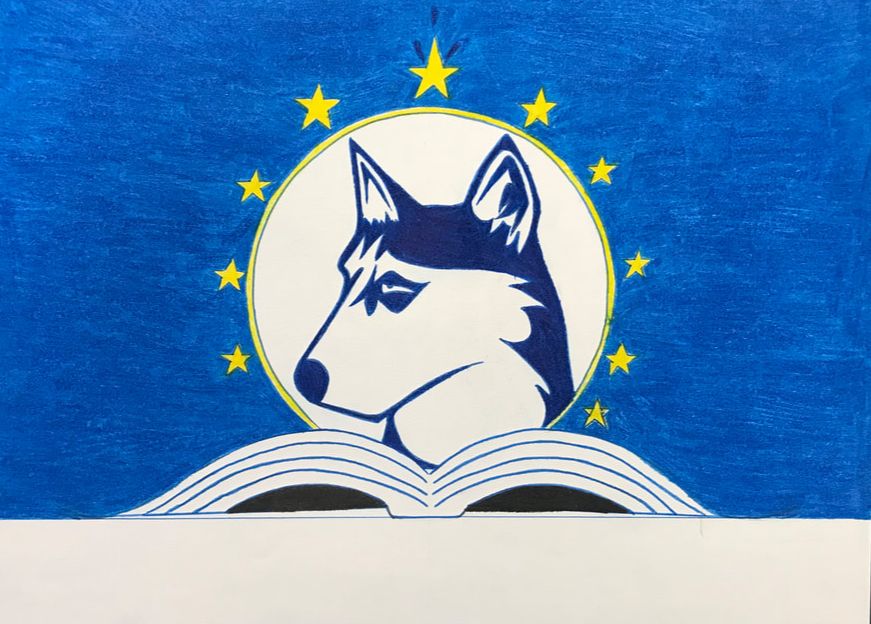
This is my second to last sketch for my flag. I changed a few things from my preliminary one, such as inverting the colors so it was bolder. Being bold makes it easy to recognize. Then I used ten stars because of the IB learner profile traits. My original plan was to keep it at 5 so it was more aesthetically pleasing, but if I wrapped it around the husky it seemed balanced. Then the husky was going to come out of the book.
|
|
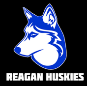
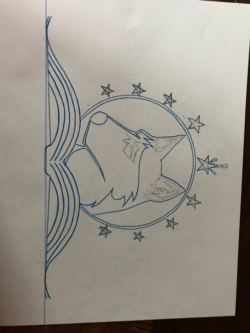
This is the outline for my sketch. I did so using Chobani cups so the circle so it would be a perfect circle. Then I used the tape roll that was a bit smaller to create the smaller circle. The husky was drawn with only looking at the picture. The stars I made small stencils for. The book was free handed with a little help of measuring. Otherwise I outlined everything in dark blue as my critique group told me to. It is less harsh on the eyes when it's not done in black.
|
|
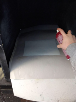
This is the process when we start gluing down our papers to the foam board. We went in the ventilator and sprayed an even coat of adhesive to the back of it. Then once it became tacky, we put it on the board and ran a credit card over it to it was sure to be stuck on.
This is my final piece mounted onto the board. I used the spray adhesive to get it on and to stick. The picture is a bit wonky due to my camera angle. For the board to fit the drawing, we had to cut off around 6 inches of board. This was done with a cork ruler and a T ruler. After we made the mark, I scored the board lightly and then one last time I cut all the way through. That was the difficult part of the process was getting it straight and not messing up the cut. |
|
|
|
My flag compared to the European union are somewhat similar. The stars around the husky are very noticeably used from their flag and draws great inspiration. They are also in a circular shape. However, what is different is I don't have 12 stars and mine vary from size. I didn't use a similar background color, however I did use a similar background color for the husky.
For the Milwaukee flag, The composition is very similar. The sun is rising out of the lake and is casting a shadow. The colors are also inspired by the Milwaukee flag, therefore it is much more prevalent in my flag too. The only thing different is the book and I used that because I'm representing an educational complex, not a city. |

|
