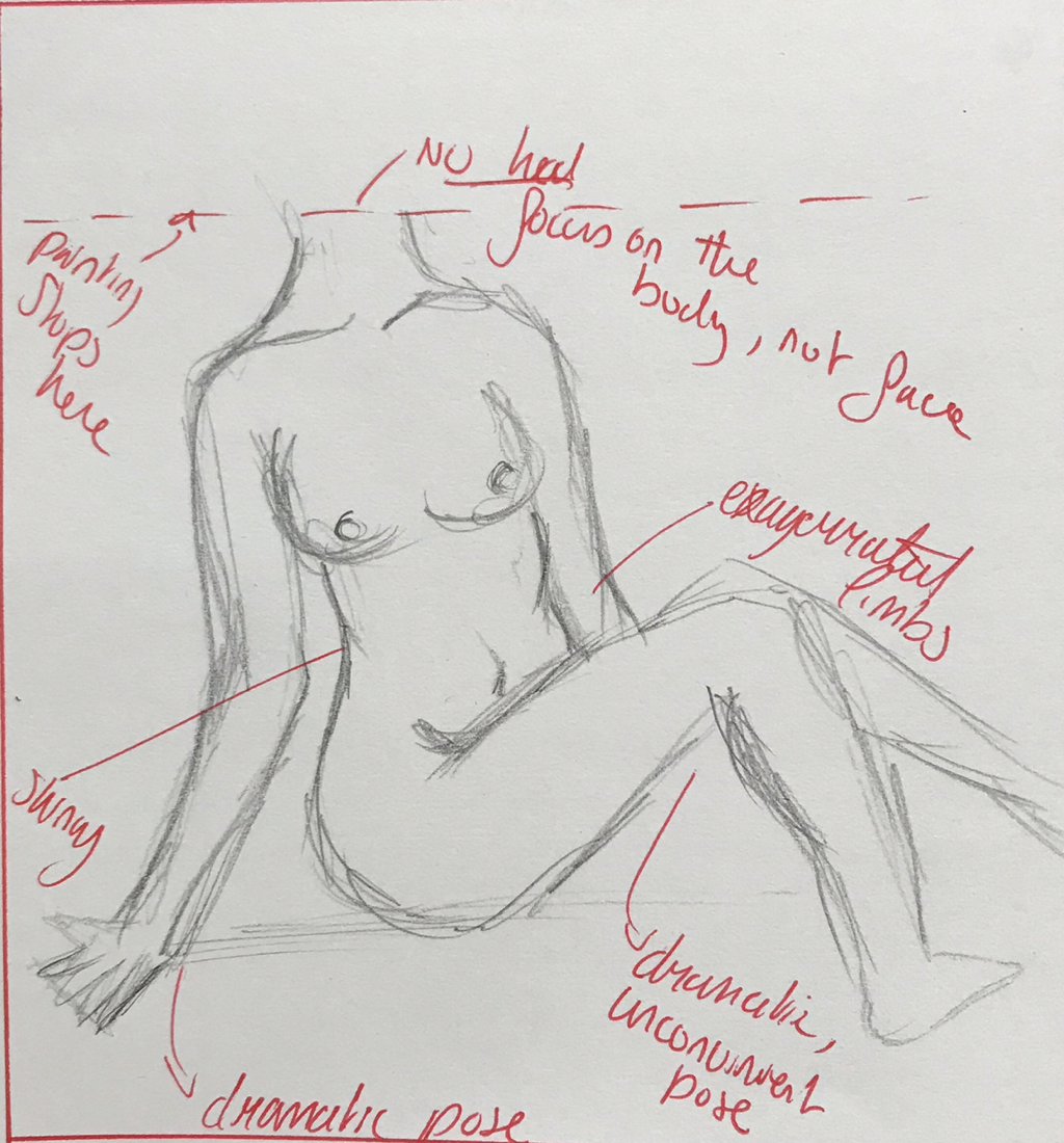
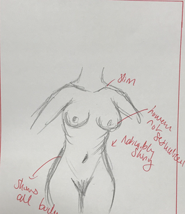
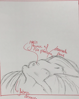
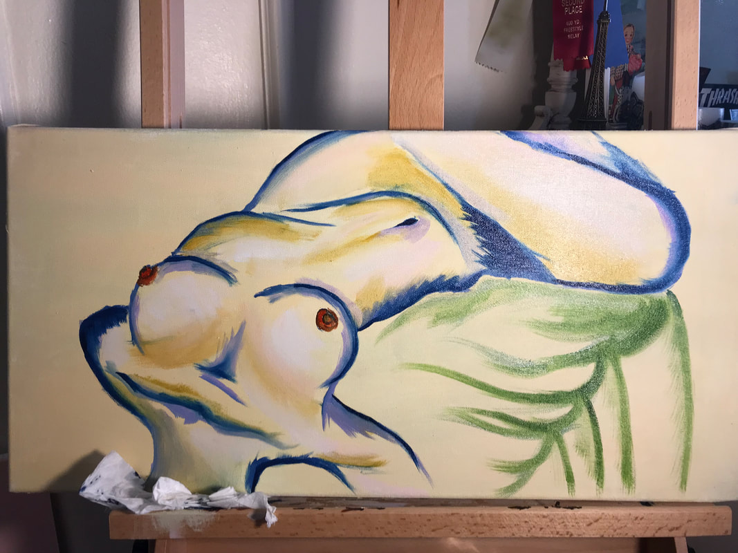
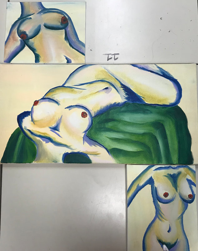
Exhibition Text
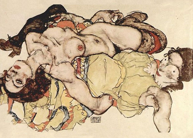
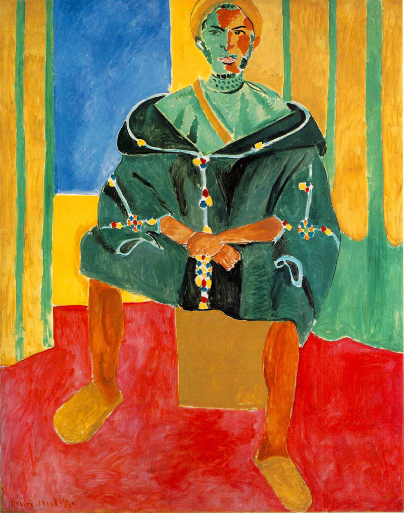
Inspired by Egon Schiele and Henri Matisse, I wanted to depict the female form in its most vulnerable state: naked. Vulnerability can be hard to show for many people, therefore I wanted to explore this topic deeper in discussion.
My first and main inspiration is Egon Shiele's two women. I wanted the dramatic laying down pose to be a part of my painting and the center of attention for the piece. I find it very expressive, yet vulnerable so I took the lady on the top half of the painting. I didn't want two girls in my painting because it can be cumbersome and too much. In addition, I thought the dead pan look of the woman was weird so I cut off the head and took it out of the painting completely. This was it made it easier just to focus on the body and the meaning I wanted to portray.
My colors were inspired by Le Rifain Assis by Henri Matisse. I liked the way it had warm and cool tones in the painting. Primary colors are a huge given too, something I wanted to incorporate into my piece. I ended up using all the colors that were used in this in my painting. I made the body out of primary colors: Blue, yellow and red. Then I added a green table cloth under the woman. Lastly, I put yellows and pinks into the body ti give it depth and shading. I liked how it turned out and these colors that I used harmonize well and work together to create a dynamic piece. |
In my preliminary sketch I wanted the pose to be dramatic however I decided against it. I don't really think it is too dramatic and it didn't get my point across. Therefore I didn't use this sketch. However I liked the sitting up pose without showing the head. That really adds focus and emphasizes the body therefore eliminating any other interpretation of the work. Clear and concise is what I was aiming for. In addition, the figure isn't as slim as I thought it would be which added as to why I didn't chose this sketch.
|
The second sketch I made is a figure standing up. This sketch was used in one of my canvases.. I liked how dramatic the body was and how skinny she can be. However, the one thing I regret is the lack of dramatic pose. It is very static when it comes to movement and I wish it was a bit more dynamic. In addition, the arms are cut off because I plan to make them come off of the canvas when I make it. I'm aiming for curvy but skinny.
|
The last sketch I made was the one I went with.. It was the direct copy of Schiele and it is very dramatic while revealing how skinny the form is. The way the model is draped across the table and twists creates movement and dynamic to the piece. Therefore I paired two static pieces with the dynamic to create a range of painting that are all appealing to the eye.I ended up with this sketch and two others for my piece.
|
Here I was beginning to do the table cloth under the girl. I took a green and started doing the outline of the cloth then I went in with a deeper green. I wanted it to look very deep and lush because green is an essential piece to my painting. I love the way the girl drapes herself and then the cloth comes out from under her and spreads out. I wanted the cloth to look soft and satin like with a sheen to it. Therefore after deepening the dark greens and shadows, I went in with a white and made it look shiny.
|
Clearly, the resemblance between Schiele's work and mine, there is a correlation. The woman laying down is taken directly from his piece. However, the colors in the original don't match what I made. Schiele uses a lot of dark and warm toned colors while I use a lot of cool toned colors.
For Matisse's work, I used the color for inspiration rather than the work itself. I wanted similar contrasting tones such as primary colors and secondary colors. I used a less saturated yellow. Then for he body to contrast the yellow I used blue and a pink for the outlining. Lastly, I added shadows through a more gold toned yellow. |